Color preferences evaluated
This week I manually categorized all of the interest form data I received so far by color! This is a crucial step before manufacturing can begin, since I need to understand the patterns of demand for different colors of filament and LCDs before I start accepting orders. This will allow me to purchase a stockpile of some LCD colors as well, since they take quite some time to arrive from overseas.
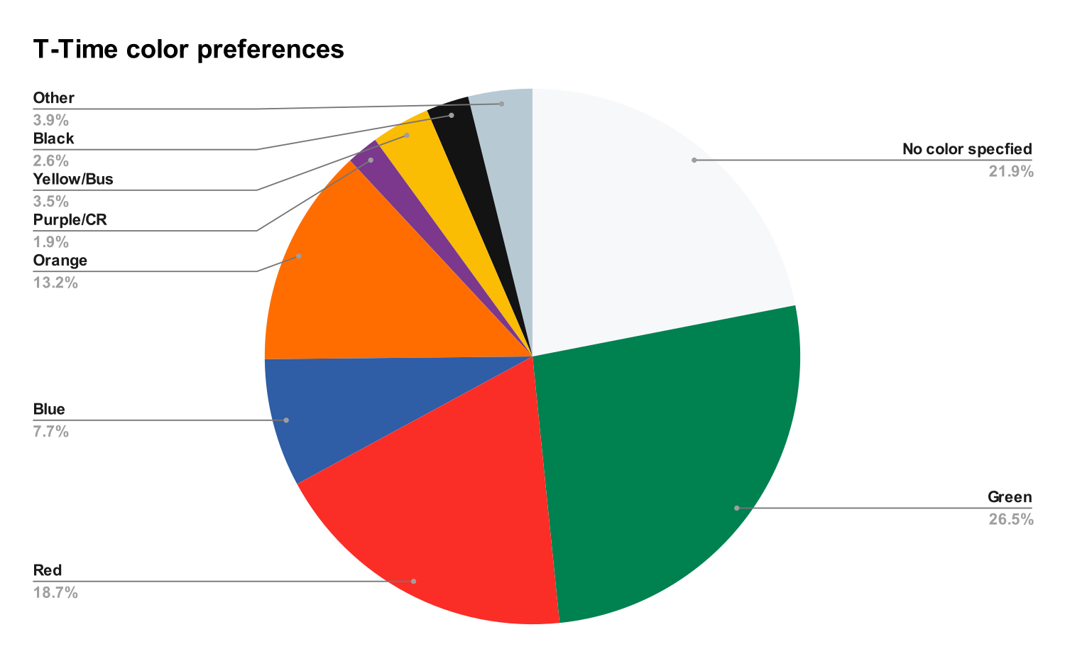
Rather unsurprisingly, the most popular colors are of the four subway lines across the MBTA, with some decent, albeit small representation for buses/commuter rail.

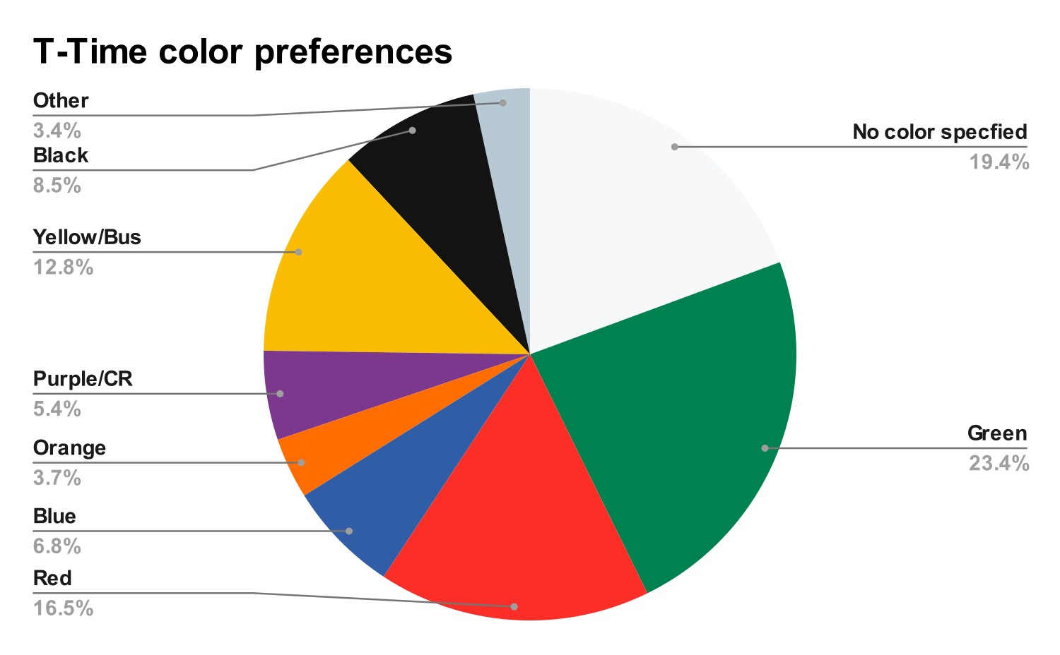
Unfortunately, I messed this chart up in the newsletter I sent out on 1/12/2026, and I unintentionally had shifted and swapped some categories. In that chart, it seemed there was a huge representation for bus colors, and although I absolutely still plan to release many of these other colors that weren't pictured in the original ads, I wanted to share that mistake so people can easily compare to what they received. The bad plot is shown below:

That's all for this update! Thanks again for supporting the project, it's really helped motivate me to keep working on it every day :)
Alec

0 Comments Add a Comment?